Sep 16, 2026Material Science
Why Your Black Leggings Don't Match Your Black Bra
Why the same black dye looks different on a bra and a legging: dye lots, fabric weights, light conditions - and the practical steps that keep a yoga collection color-consistent.
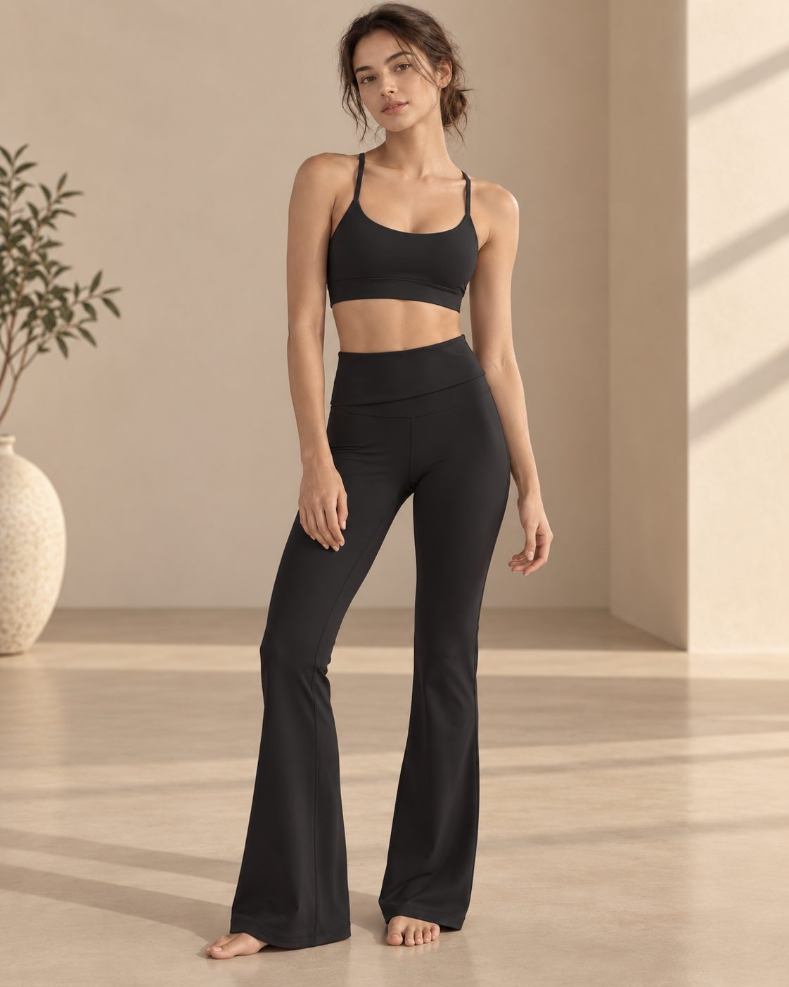
A brand founder sent me a photo last month. Two garments side by side on a white table: a black sports bra and a pair of black leggings, both from her first production run, both "black" on the purchase order. Except they weren't. The bra was a deep, warm black. The leggings had a faint blue-grey cast. On the website, in the photos, they looked like a set. In the customer's hands, they looked like a mistake.
She asked me what went wrong. The answer is more interesting - and more fixable - than you might think.
Dye Lots: Why the Same Color Is Never Quite the Same
Fabric is dyed in batches called dye lots. Each lot has its own temperature history, its own dye bath chemistry, its own timing. Even in a well-run factory with calibrated machines, the black from lot A will be marginally different from the black in lot B. Not different enough to notice if you hold two swatches side by side under the same light - but different enough that a customer wearing the top from lot A and the leggings from lot B might catch it in a mirror.
This is not a defect. It is physics. Dye is chemistry, and chemistry has variables.
What separates a good production partner from a careless one is whether they track their dye lots and tell you when lots change. At Miss K, we flag lot changes before bulk cutting starts, so the brand knows: your leggings and your bra are from the same dye lot, or they aren't, and here is what the difference looks like.
Fabric Weight Changes How Color Reads
The same dye on two different fabric weights will not produce the same perceived color. A 220 gsm top absorbs and reflects light differently from a 260 gsm legging - the denser knit has more fiber per square centimeter, so it holds more pigment and reads darker and richer. The lighter fabric reads lighter and slightly more translucent even when the dye recipe is identical.
This is why asking for "the same color" across a bra and a legging is more complicated than it sounds. The dye recipe might be the same, but the fabric construction is different, and the result will not match perfectly. A good production partner will tell you this at the sampling stage instead of letting you discover it at delivery.
Light Changes Everything
Here is a test you can do right now with any two pieces of activewear you own. Look at them under your bathroom light. Then take them to a window. Then step outside. The color will shift each time.
Studio photography, fluorescent fitting rooms, direct sunlight and phone screens all render the same black differently. Your customers will see your products in all of these conditions. So the goal is not a color that looks the same everywhere - that color does not exist. The goal is a color that holds together under the widest range of conditions, and that starts with the fabric, not the photo editing.
This is why we confirm colors at the sampling stage under natural light, not just in a sample room with controlled lighting. And it is why we ask brands to approve colors on the actual fabric weight they will be producing, not on a screen.
Practical Steps for Color Consistency
If you are building a yoga line and color consistency across your collection matters to you, here is what to ask for:
• Lab dips before bulk. A lab dip is a small sample of your fabric dyed to your target color. Approve it before the full production run, not after.
• One fabric source per color. Mixing suppliers for the same color across styles is the fastest route to visible mismatches.
• A physical color standard. A swatch of approved fabric that bulk is checked against - not a screen image, not a Pantone card alone.
• Dye lot tracking. Ask your production partner to flag when dye lots change between your styles, so you can plan around it.
None of this is complicated. It is attention to detail, applied consistently, by people who have seen what happens when it is skipped.
Why We Keep Our Palette Tight
Our range at Miss K runs in five core colors: Black, Espresso, Cream, Sage and Blue Grey. We keep it tight on purpose. Fewer colors mean tighter dye lot control, better consistency across styles, and a collection that looks like it belongs together on the shelf.
It also makes life easier for the brands we work with. When your whole line runs from the same palette, your tops match your bottoms, your reorders match your originals, and your customers can mix pieces across styles without worrying about near-miss colors.
If color consistency is on your list for your next collection, we would be glad to walk you through our process. Browse the reference styles on our products page, or reach me directly at info@misskyoga.com or WhatsApp +86 136 4085 9182.